I suggest to implement the following feature:
Provide more data graphics symbol groups and/or make data graphics more flexible.
Data graphics are nice e.g. to show trends in a compact and easily understood way: A green arrow pointing north-east or north shows a growing trend and that you’re doing good or really good. At least when used for categories like profits, revenues, performance.
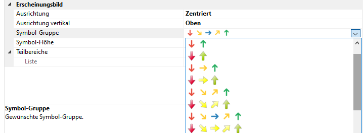
For growing expenses, costs, losses and so on the arrows pointing up should rather be red while the arrows pointing down should be green.
New data graphic symbol groups for negative categories might help a little but maybe the data graphics need to be made more flexible. E.g. it’s currently not possible to change the symbol group of a data graphic via a formula.